Rethinking the HR Experience for a Connected World
Introduction
I partnered with a newly launched company to build a user-centered brand identity and define the core user experience for their product in the Human Resource Management (HRM) space.
Challenge
As a new company, the client faced two big challenges:
- They didn’t fully understand their users’ real needs, goals, and pain points.
- They needed to quickly create a brand presence that felt trustworthy, credible, and approachable in a complex and conservative space.
My Role
As the lead UX designer and strategist, I worked closely with stakeholders to define user needs and shape the brand from the ground up. I conducted stakeholder interviews, built user personas, and led workshops to develop the brand’s tone and positioning.
Using Figma for prototyping and iterative design, I translated research insights into wireframes. This ensured usability, accessibility, and technical feasibility remained priorities throughout the project.
Process
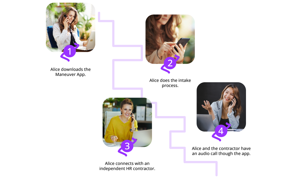
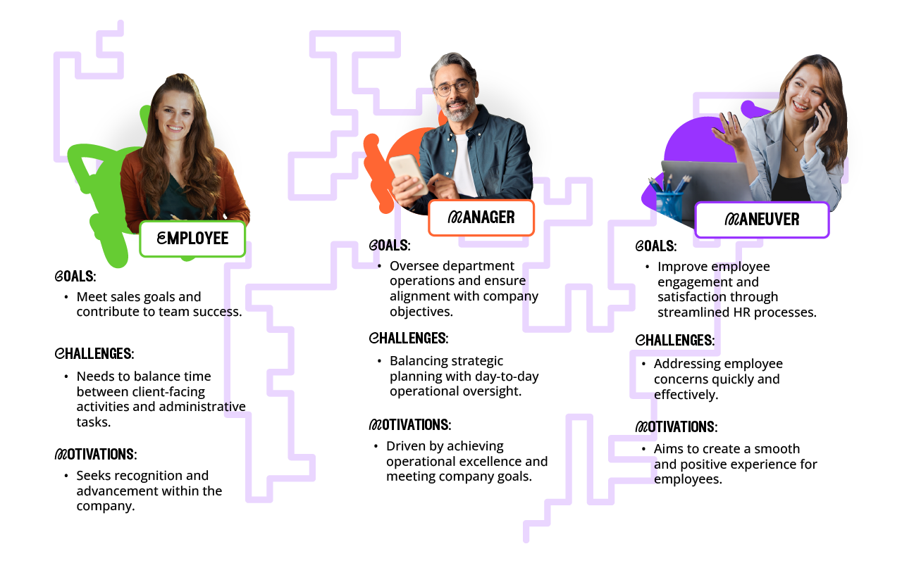
I started by talking directly with the people who mattered most: employees, HR reps and managers, gathering real insights about what worked and what didn’t. From there I mapped out the existing workflows, digging into the friction points that slowed users down and caused confusion. Using that feedback I built early wireframes and prototypes.
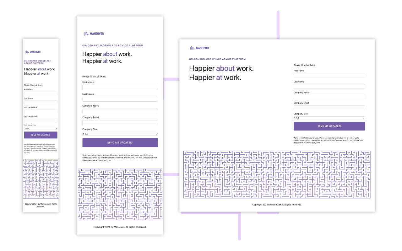
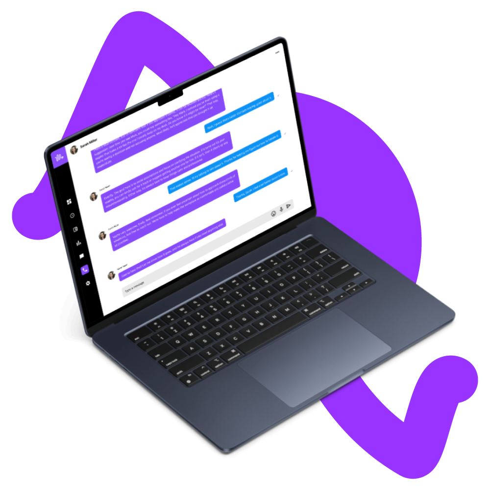
I tested and refined them through multiple rounds of collaboration. I ran usability tests to validate the designs then turned those findings into clear actionable updates. Next, I started building the visual foundation for the brand. Crafting identity assets that would show up consistently across every digital touchpoint. I designed UI components and layouts that stayed true to accessibility best practices, making sure everyone could use the product with ease.
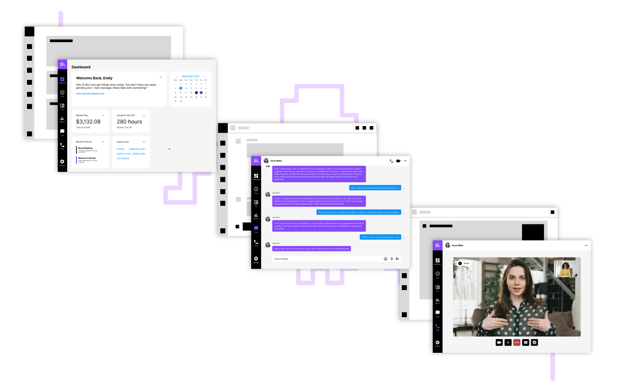
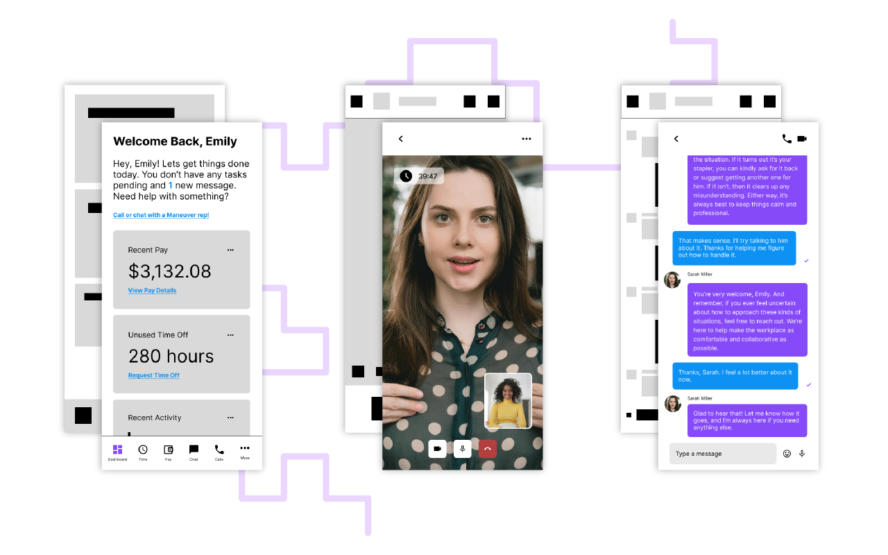

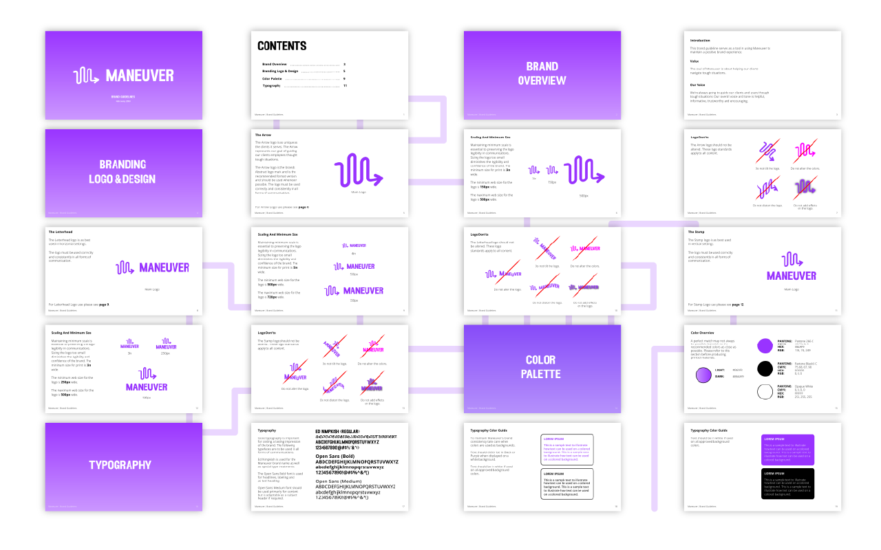
I created early visual ideas to set the brand’s tone making sure every design choice helped users feel confident and supported. I built a scalable visual system that could grow with both marketing and product needs tying everything together with: high-fidelity layouts, custom iconography, and flexible style rules.
Finally, I developed a full set of brand guidelines ensuring that wherever the brand showed up it spoke the same consistent language.
Outcome
By the end of the project the team had a clear brand identity and a digital experience that felt intuitive, consistent, and easy to use. Early usability testing showed major improvements in task completion times and user satisfaction. Employees and managers reported feeling more confident navigating key workflows.


The scalable design system didn’t just support the product, it gave the marketing team a strong, unified visual voice which helped them launch campaigns faster. Most importantly the company entered the market positioned not just as another ERP option, but as a people-first product built around real user needs.